

Chappellet, Pritchard Hill Cabernet Sauvignon, Napa Valley, 2014, 6x75cl
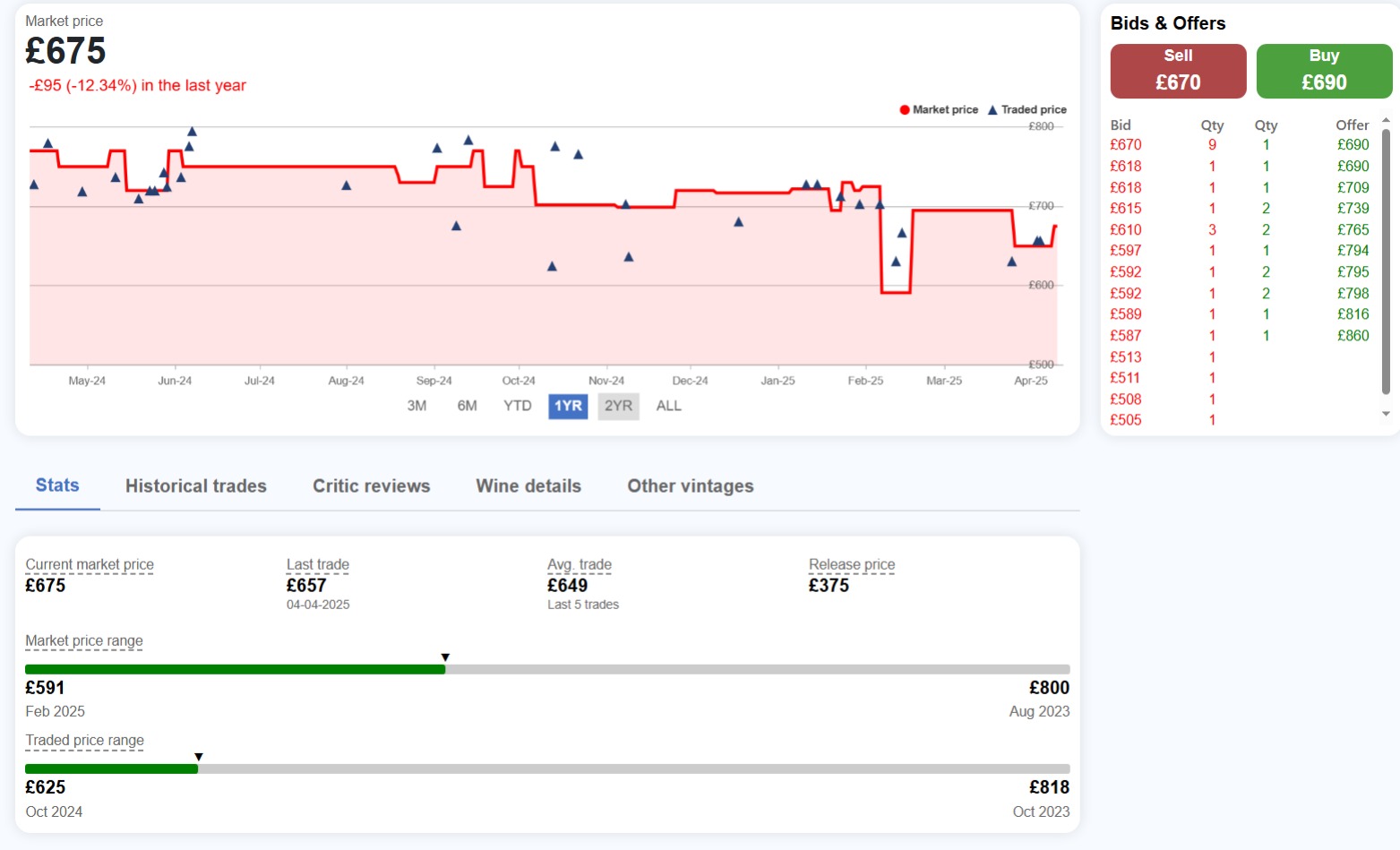
Market price
×The best available price you can buy the wine for on the secondary market.
Please click here for the full details and formulas used.
Last traded price
×The most recent price and date at which the wine was last traded.
Average trade
×The average price of the last 5 trades.
Release price
×The price that the wine was initially released on the market for.
Market price range
×Shows the highest and lowest market price since being listed on BordeauXchange. The arrow/green bar represents where the current price sits on that range.
Traded price range
×Shows the highest and lowest price a wine has traded for since being listed on BordeauXchange. The arrow/green bar represents where the last traded price sits on that range.
Distance from trade
×The difference between your price and the opposing bid or offer price.
Example:
You have placed an offer to sell for £1,000 and the highest bid is £800, the difference is 20%.
Price change
×The percentage change from the previous trade.
Order type
×Buy/Sell now
Buy or sell at the current bid/offer price on display. A trade will execute immediately.
Bid to buy / Offer to sell
Set the price you are willing to buy/sell at and your order will be added to the order book. If a matching bid/offer is placed, a trade will automatically execute and you will be notified.
Best order
×Is your bid or offer the highest/lowest of all.
Order book
×Order book is a real-time, electronic list of buy and sell orders, used to match buyers and sellers. It consists of bids (highest prices buyers will pay) and offers/asks (lowest prices sellers will accept).
Score vs Price
×Each dot is a vintage. The further right it sits, the higher the critic score; the higher up, the more expensive.
The dashed trend line is the model's expected price at each score level — think of it as fair value based on this producer's own range.
Above the line = priced at a premium to its score.
Below the line = potential value pick.
R² tells you how reliable the trend line is. Close to 1.0 = scores strongly predict price here. Close to 0 = other factors (age, rarity, availability) matter more.
Vintage Comparison
×Tracks how each vintage's price has moved over the selected period. All series use the wine's market price (the best available offer price) as the data source.
Rebase mode — all lines start at 100 so you're comparing performance, not price level. A wine at £5,000 and one at £500 are on equal footing. Above 100 = price has risen; below 100 = price has fallen.
Absolute mode — shows the actual £ market price for each vintage over time, so you can compare price levels directly.
Use the range buttons to change the time window. Use the All Vintages dropdown to show or hide individual vintages.
Age vs Price
×Each dot is a vintage. X-axis = how old the wine is. Y-axis = its current price.
The trend line shows whether older wines in this range tend to be more expensive. A steep upward line = age matters a lot here. A flat line = age is not a major driver of price for this producer.
R² shows how well age alone explains the price differences — 1.0 is a perfect fit, 0 means age has no predictive power.
Producer Index
×A performance comparison between this wine and the broader producer range.
Blue line = equal-weighted average of all the producer's vintages — each vintage counts the same regardless of price.
Orange line = this specific wine's price performance.
Both lines start at 100 at the beginning of the selected period. If the orange line is above the blue, this wine is outperforming the rest of the range — and vice versa.
The table below shows the return figures for each time period at a glance.
Trading History
×Shows actual trade prices vs the listed market price over time.
Orange line = market (offer) price each month.
Blue line = average price trades actually executed at. Months with no trades carry forward the last known price.
Triangles = the highest (green) and lowest (red) individual trade each month.
Columns = number of trades that month (right axis).
The table below breaks down each traded month: market price, average trade price, whether trades executed at a premium or discount to market, trade count, and total volume.